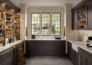
A kitchen colour is a ten-year decision at least, and often a twenty-year one. That is a long time to live with a shade you chose because it looked well on somebody else’s island in a photograph taken in a different country under different light.
Our standard palette runs to thirty-two-plus shades, and we can colour match to any BS or RAL reference you bring us, so there is no shortage of choice. The difficulty is never finding a colour you like. It is finding one you will still like when the novelty has worn off and the room is just your kitchen again. Here is how we go about it.
Start with the light, not the colour
Before you look at a single door, work out which way your kitchen faces. It will narrow the field faster than any other single fact about the room.
North-facing rooms get cool, steady, blue-toned light all day. Cool colours compound that. A grey that looked sophisticated in the showroom can turn flat and slightly cold on a north wall in February. These rooms want warmth pushed back into them — Shell, Ivory, Mussel, Taupe Grey, Cashmere. Warm neutrals do the heavy lifting here, and the greens with yellow in them, like Sage and Cardamom, sit beautifully.
South-facing rooms get warm light that intensifies through the afternoon. They can carry cooler, deeper shades without ever feeling cold, and they are where the blues earn their place — Pantry Blue, Airforce, Parisian Blue, Marine, Slate Blue, Indigo. A south-facing room will also forgive a dark colour far more readily than a north-facing one.
East and west are the interesting ones, because they change character halfway through the day. An east-facing kitchen is bright and cool at breakfast and soft by evening. Choose for the time of day you actually use the room most, and be honest about when that is.
The palette, by mood
Quiet neutrals. Brilliant White, Porcelain, Ivory, Shell, Stone, Stone Grey, Light Grey, Dust Grey. These are the colours that let everything else in the room speak — a timber floor, a piece of stone, a view out a window. They are also the colours people most often accuse of being safe, and most rarely regret. If your kitchen is open to a living space with a lot going on already, quiet is not timidity. It is judgement.
Greens. The most requested family we have, and with good reason on this island — a green kitchen borrows from what is outside the window. Sage and Cardamom are gentle and warm. Reed and Willow are mid-toned and easy. Viridian, Heritage Green and Deep Forest are serious commitments that look magnificent in the right room and overwhelming in the wrong one.
Blues. Pantry Blue and Light Teal are soft and forgiving. Airforce and Slate Blue are the workhorses — grown-up, unfussy, hard to tire of. Parisian Blue, Marine and Indigo are deep and dramatic and want good light and a bit of space.
Deeper drama. Lava, Monument Grey, Gunmetal Grey, Graphite and Cannon Black. Used across an entire room these can be superb, but they are unforgiving of poor light and they show every fingerprint and every crumb. Used on part of a room — which we will come to — they are one of the most reliable moves in kitchen design.
Warmth and character. Vintage Pink and Antique Red are braver choices that work surprisingly often in older houses, particularly on a dresser or a single run rather than everywhere.
Metallics. The Ferro range brings true metallic paint — Iron, Copper and Brass, smooth or weathered. This is a statement, not a background, and it belongs on an island or a bank of tall units rather than wrapped around a whole room.
Wood. If you want grain rather than colour, oak ranges take six stains — Light Oak, Parched Oak, Espresso, Weathered Silver, Carbon Black and Hacienda. Timber ages differently from paint. It does not date; it just gets older, which is a different thing entirely.
Two-colour kitchens, and the rule that keeps them timeless
Two-tone kitchens are everywhere now, and they will date badly if they are done carelessly. There is one rule that protects you, and it has held for as long as we have been fitting kitchens.
Put the darker colour on the smaller area.
Deep Forest on the island with Shell on the perimeter will look considered in 2036. Shell on the island with Deep Forest wrapped around the whole room will look like a decision made in a particular year. The eye reads the larger area as the room’s colour and the smaller as the accent, and it wants the accent to be the stronger one. Get that the wrong way round and the room feels heavy no matter how good the individual shades are.
The same logic covers base and wall units. Darker below, lighter above, is not a fashion — it is how the eye expects weight to sit in a room, which is why it has never really gone away.
Islands, and when to keep the perimeter quiet
An island is the natural home for a colour you love but would not want everywhere. It is a discrete object, it is usually the first thing you see coming into the room, and it is small enough that a strong shade reads as intent rather than as commitment.
Keep the perimeter quiet when the room is open-plan and already carrying furniture, art and a view; when the ceiling is low or the light is poor; or when there is a lot of glazing, because a busy perimeter competes with the window rather than framing it.
Let the perimeter carry the colour when the kitchen is a proper room with a door on it, when there is timber or stone underfoot to hold it together, and when you know your own mind. A single-colour kitchen in a strong shade, done properly, is more confident than any two-tone scheme.
Express, paint to order, or colour match
Three routes to a finish, and they are not equal on time.
Express colours are popular pre-finished shades held in selected ranges on a shorter lead time. If a builder is waiting or a date is fixed, start here — the list is shorter, but every shade on it is there because it is the one people keep choosing.
Paint to order opens the full palette across most of our ranges. Your doors are finished specifically for you, so it takes longer.
Colour match is for when you already know. Bring us a BS or RAL reference, a fabric, or the lid of the paint tin, and we will match the collection to it. Longest route, and the right one when the kitchen has to answer to something already in the house.
How to sample properly
Nearly every colour regret we have seen traces back to a decision made too quickly in the wrong light. Four rules.
- Use a sample door, not a paint chart. A chart is flat paper. A door has a frame, a panel and a profile, and the colour changes across all three as the light moves. They are not the same object.
- Look at it three times a day. Morning, mid-afternoon and under your own lights at night. If it survives all three, it will survive the next decade.
- Hold it against your worktop. The worktop is the largest continuous surface in the room and it will influence the door colour more than your walls will. Judge them together or you are judging neither.
- Live with it for a week. Leave the sample standing in the room. The colours that quietly stop bothering you are the ones to buy.
Come and see them
Colour is the one part of a kitchen that genuinely cannot be chosen on a screen. Every monitor lies, and photographs lie twice.
You can see the full painted collection in our Rooskey showroom, on the Tarmonbarry road ten minutes from Carrick-on-Shannon, by appointment Monday to Saturday. Plan a visit, or request the brochure and take the palette home with you. Either way, take your time over it. It is a long decision, and it is worth getting right.